Eltze, Frederick. The New Table-Book, or, Pictures for Young and Old Parties. Edited by Mark Lemon. London: Bradbury, Evans, and Co., 11 Bouverie Street, 1867.
During the Victorian period, the convergence of an expanding middle class and their love of reading, the mechanization of book production, and the growth of the publishing industry led to an explosion in the number and types of books being produced. One of these types was the gift book. As the name suggests, these books were meant to be given as gifts, especially during the Christmas season. Usually published and advertised late in the year but postdated so that it could be sold the next year, these books were designed to be seen rather than read. This meant that the text was often superficial, such as anthologies of previously printed verses, prayers, and hymns. Instead the focus was on the visual elements of the book. Illustrations in these works were high quality wood or steel engravings (sometimes in colour) and the bindings in cloth, silk, or leather were ornate, often embossed and elaborately gilded. This was meant to appeal to the middle-class consumers who wanted items that appeared to be expensive, but in actuality the books cost between fifteen shillings and one guinea, largely due to its mechanical production.
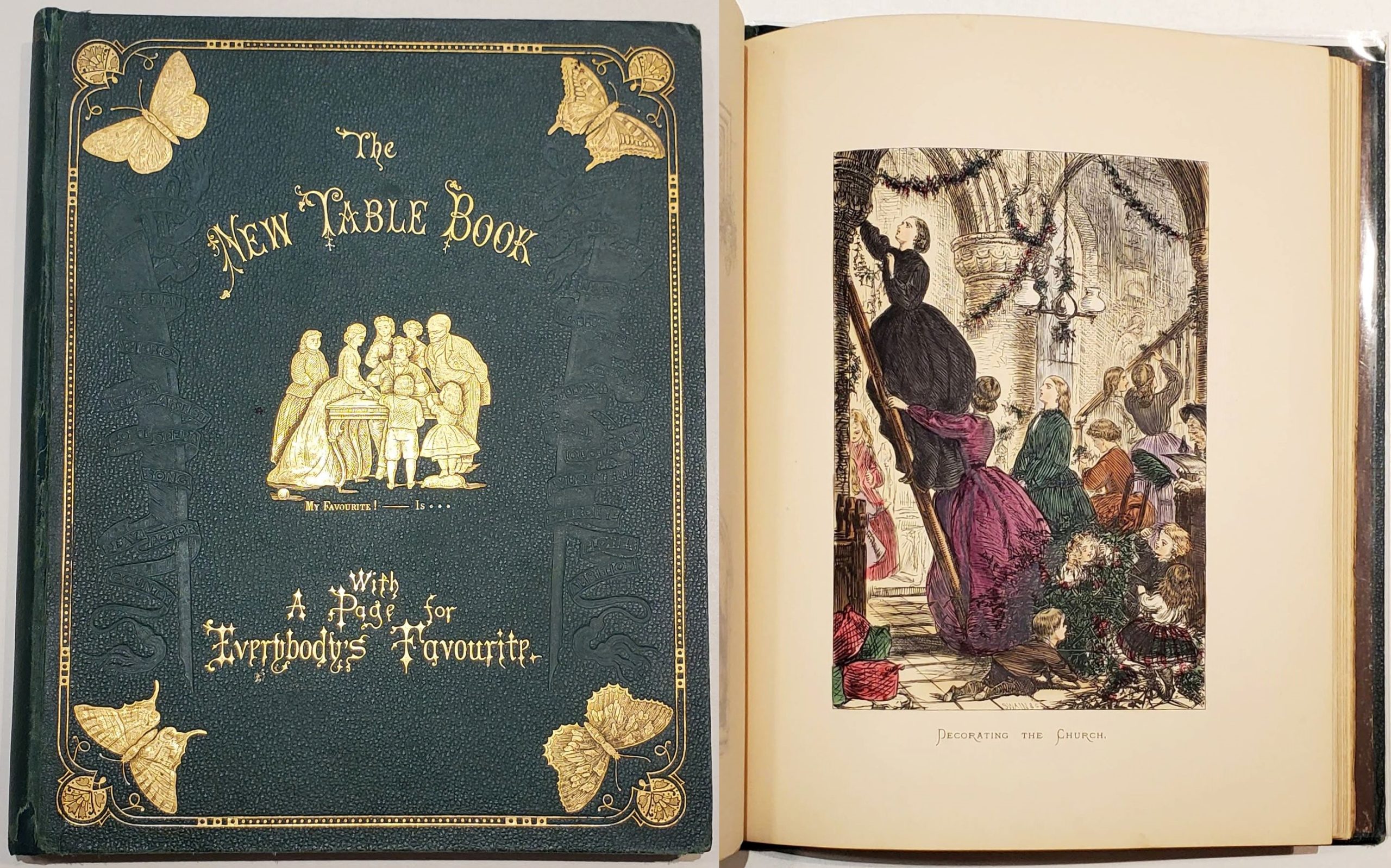
New Table-Book cover and illustration.
This new ASC acquisition is a gift book from 1867. While gift books were meant to be given at Christmas, they did not typically contain Christmas content. This book was given as a gift at Christmas in 1872, and unusually it has a number of illustrations related to Christmas including "A Merry Christmas" and "The Christmas Dinner." 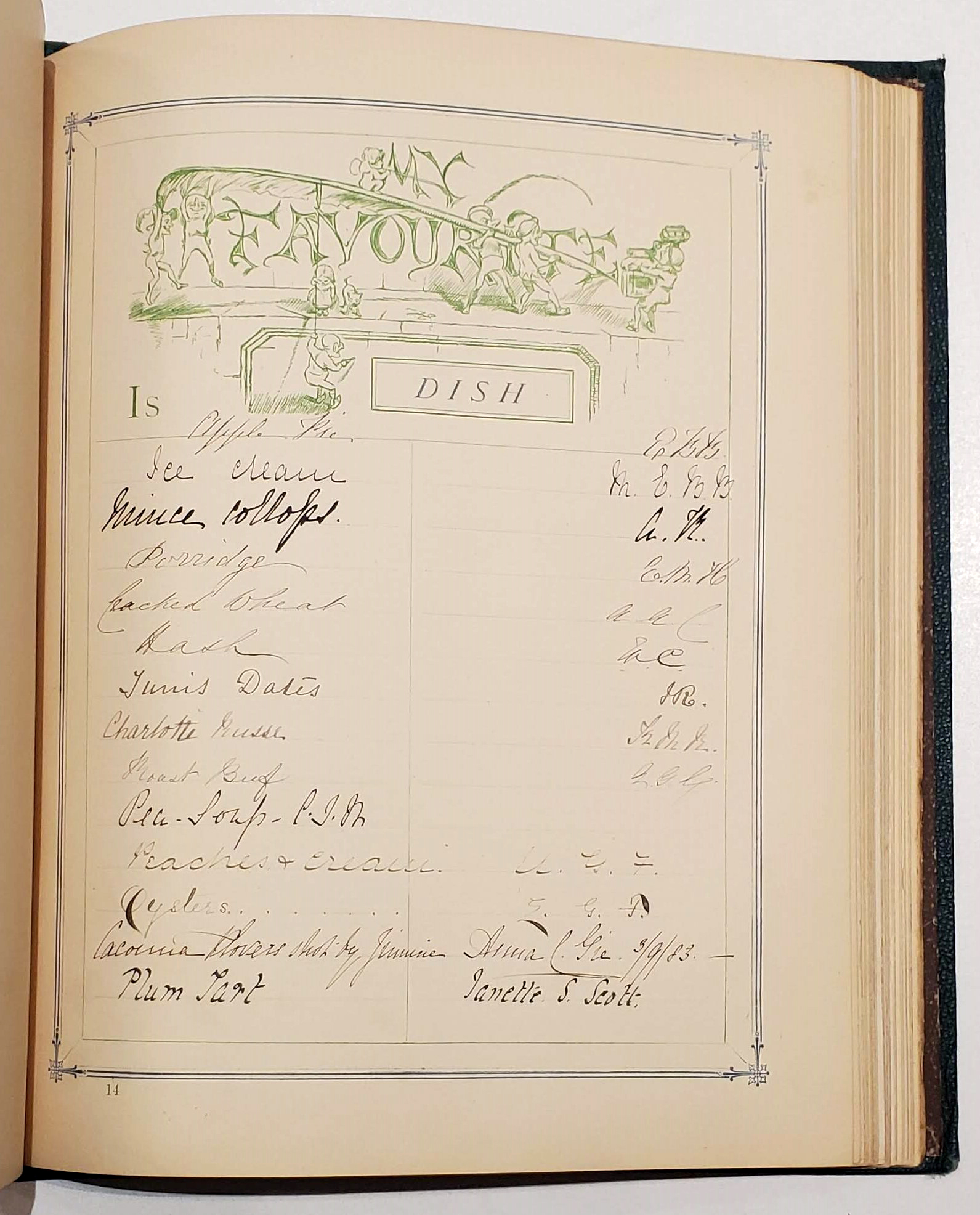 Its advertisement in The Athenaeum in December 1866 was focused on these illustrations and the binding of cloth and gold based on a design by John Leighton. Leighton was a prolific book designer, thought to have created more than 80 book cover designs. Also included in the ad are reviews that highlight a unique aspect of this gift book, its pages dedicated to writing down "favourites" including favourite queen, king, author, motto, colour, dish, flower, play, and more. As the Pall Mall Gazette points out "of course such a catalogue, honestly drawn up, might afford a curious insight into the character of the person under confession..." Luckily for us, entries are written on every page. Take the contributor Ellen G. Foster, or E.G.F., who had written on almost every page. Her favourites include Charles Dickens (for favourite author), Elizabeth Barrett Browning (poet), Victoria (queen), letter-writing (amusement), oysters (dish), the motto "Such is life", and my personal favourite, her ambition is "to do my duty in that station of life in which it hath pleased God to place me." Positively Victorian. Some other highlights include favourite virtues (truth, sympathy, sincerity, patience, and punctuality), and other favourite mottos ("never say die" and "paddle your own canoe") and ambitions ("to make others happy" and "to have many friends, few acquaintances" among others). Finally, despite the book being produced in England there are a number of Canadian connections in the favourites. E.G.F.'s favourite hero was Canadian minister Charles Chiniquy. Ontario, Quebec, and King's County, Nova Scotia are listed as favourite counties, and Nellie G. Foster's favourite statesman was Sir John A (perhaps Sir John A Macdonald), while T.A. Crane preferred Nova Scotia politician Joseph Howe.
Record: 18775
Browning, Elizabeth Barrett. Sonnets from the Portuguese. New York: Elston Press, 1900.
As discussed in a previous post, the Arts & Crafts Movement was a reaction to the Industrial Revolution that focused on craftsmanship and the union between beauty and utility. This movement was exemplified by the work of William Morris and his Kelmscott Press. His work was so significant that it influenced printers and private presses in England and North America, like the Elston Press in New York. It was started in Manhattan in 1900 by owner and printer Clark Conwell and wife, designer and illustrator Helen Marguerite O'Kane, before moving to the New York suburb New Rochelle in 1901, remaining there until the press closed in 1904. Its books, like Morris', were printed by hand-press in limited editions on handmade paper or Japanese vellum. Sonnets from the Portuguese was the first book printed by Elston press, while it was still located in New York City, and it is visibly similar to Kelmscott Press books. The type, called Satanick, was called the Chaucer font by Conwell because of its similarity to the typeface used in the Kelmscott Press edition of Chaucer. In addition, the mis-en-page, or layout of the page, is complex and evokes Morris' work, like The History of Reynard the Foxe, with designs by O'Kane bordering the text. Its production was not without issues though. Alongside the book there is a note from Conwell laid in that states that during production Conwell was unable to find experienced hand-pressmen, and being unable to complete the book on his own, he accepted the use of a press owned by another firm. He assures subscribers that all future publications would be printed by hand but "he feels called upon to offer no apologies for having departed from the original intention in this unavoidable instance."
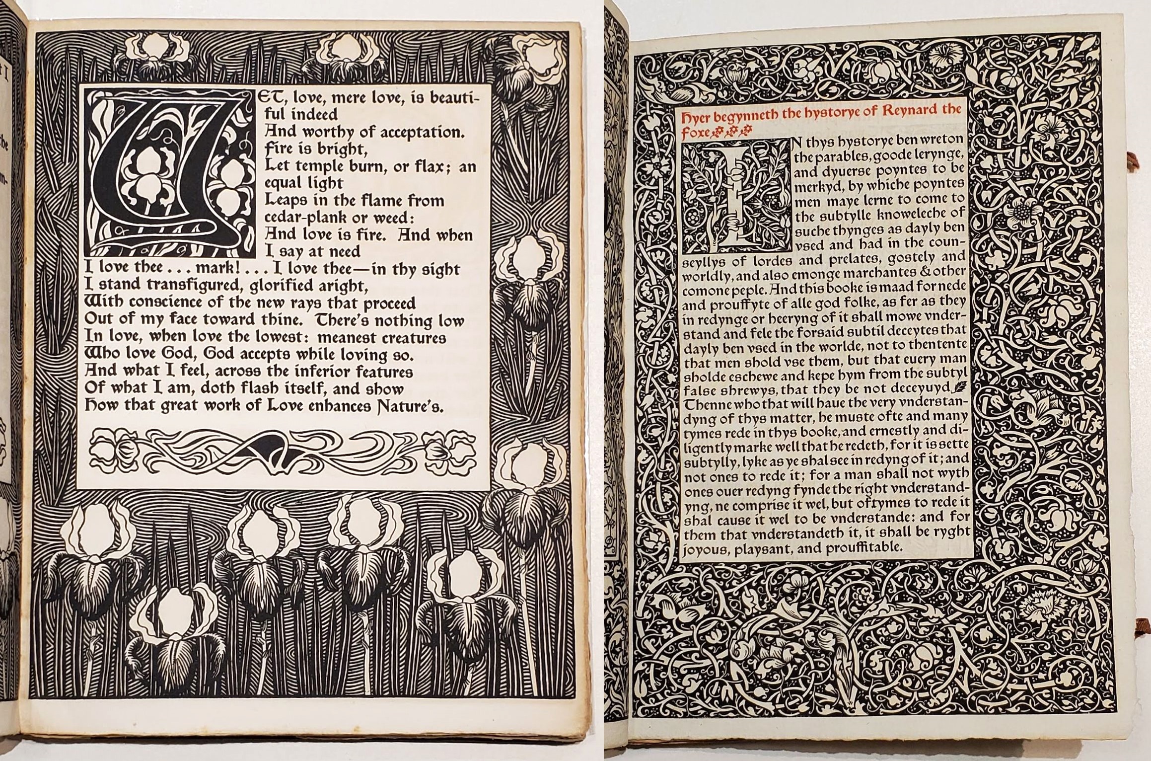
A page from Sonnets from the Portuguese (left), and Reynard the Foxe (right).
Elston Press was not immediately appreciated, editor Fitzroy Carrington said that Sonnets from the Portuguese's increased blackness of the type and decorations did not achieve greater beauty and legibility, but rather an appearance that was somewhat heavy. Now though Elston Press' work is recognized as a mixture between Morris' Arts & Crafts movement and Art Nouveau, defined by its nature imagery and curved lines. Elston Press was able to take the traditional points of Kelmscott Press while bringing its own unique style to make it distinctive.
Record: 18829
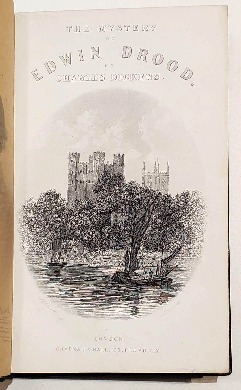
Dickens, Charles. The Mystery of Edwin Drood. London: Chapman and Hall, 193 Piccadilly, 1870.
Engraved title page for Mystery of Edwin Drood.
The Mystery of Edwin Drood was Dickens' last novel. First published as a serial, twelve issues were planned, and Dickens wanted to have much of it written before publication. He began writing in August 1869 and the first issue was published in April 1870, selling nearly fifty thousand copies. By the time the third issue was published in June 1870 Dickens already had three more written, but after working on the novel on June 8th, 1870 Dickens had a stroke and passed away the next day. He only spoke briefly to others about the plot and said nothing about the murder in the novel (and who committed it), so The Mystery of Edwin Drood was left unfinished at 23 chapters. While many have since tried to finish the novel, it was only the original 23 chapters published in this first edition.
A first edition of The Mystery of Edwin Drood is seen as quite common in comparison to other Dickens first editions, so what makes this copy unique, as I have said many times before, is the binding. In this case Dickens' novel is bound in an ornate Cosway-style binding. Cosway bindings first emerged at the beginning of the 20th century by the bookseller Sotheran's. There managing director J.H. Stonehouse created a leather binding that was inset with a miniature painting on the inside or outside cover. He named the binding style Cosway after miniaturist Richard Cosway, despite him never being involved and dying nearly 80 years earlier. Instead the miniatures were painted by Miss. C.B. Currie, who painted approximately one thousand miniature watercolour paintings for bindings in the style of Richard Cosway. The miniatures were painted on ivory and protected by glass. The subject matter would also be related to the book in some way, often depicting the author, characters, and/or illustrations from the book. The distinction between Cosway bindings and Cosway-style bindings is determined by who made the binding. In addition to the miniatures being painted by Miss. Currie, Cosway bindings were bound by Rivière and Son in London. When the book is bound by a different binder, but especially when the miniature is painted by a different artist, the bindings are called Cosway-style bindings. These binders include Bayntun-Rivière, Sangorski & Sutcliffe, and Bayntun of Bath, the binder of this book. We know the binder because he as stamped his name in gold on the inner front turn-in. Signing Cosway and Cosway-style bindings in this way was common and beginning in 1913 Cosway bindings were given a limitation statement which assigned a number to the binding and was signed by Stonehouse and Miss. Currie. This Cosway-style binding of The Mystery of Edwin Drood is a green morocco leather which contains an inset miniature portrait by an unknown artist of Dickens in his later life. The binding is heavily gilt with gold on the covers, spine, and edges. Inside the cover is also heavily decorated. The leather on the turn-ins inside the covers is gilt and the pastedowns and endpapers which line the covers are green silk, which can be called doublures when the material or decoration is not typical. This acquisition adds another book to the ASC collection which highlights the various styles of high-quality bindings.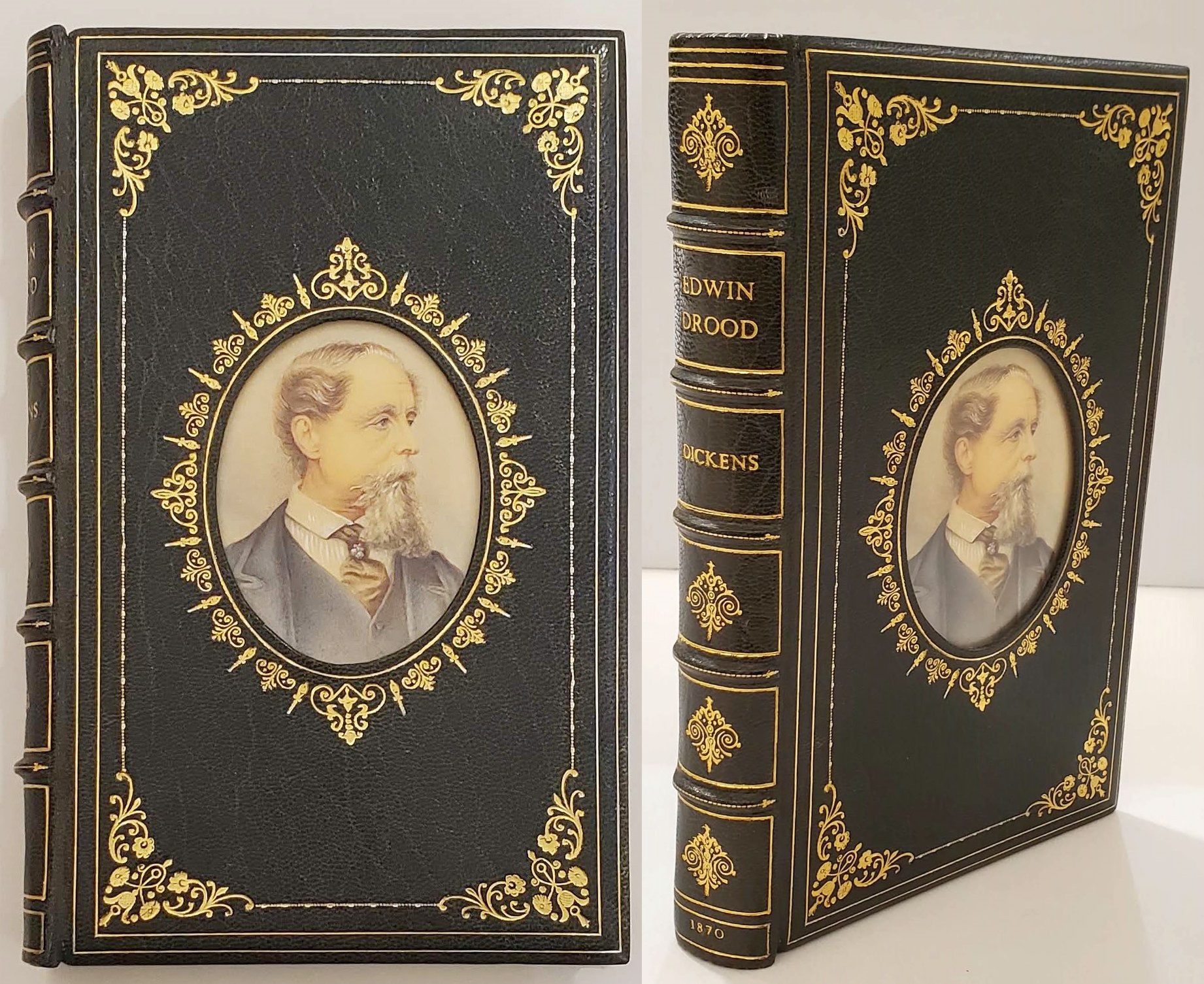
Record: 18850
Written by Taylor Tryburski
References
https://victorianweb.org/art/design/books/cooke1.html
"The New Table-Book." The Athenaeum, no. 2044 (December 29, 1866): 866.
Thompson, Susan Otis. American Book Design and William Morris. New York: R.R. Bowker Co., 1977.
Thomson, J.C. (Joseph Charles). Bibliography of the Writings of Charles Dickens. Warwick: J. Thomson, 1904.
https://www.ligatus.org.uk/lob/concept/4710
https://www.abebooks.com/books/rarebooks/cosway-bindings
